
The discussion of effective KPI dashboard examples is essential to any contemporary business that wants to transform data that seems to be very complex into actionable strategic information. Did you realize that organizations that use visual data discovery tools have a much higher probability of discovering changes in the market than those that simply use spreadsheets, which are inactive?
W. Edwards Deming once said, " Without data, you are merely another individual with an opinion. However, in contemporary business, it is not often that one has issues with data but with its interpretation. Information overload obscures strategic clarity. This is where the architecture of visual performance tracking becomes a critical competency for leadership teams. The goal is to grab the audience’s attention right from the start using relevant statistics and structured insights.
This article deconstructs ten essential dashboard frameworks designed to align daily operations with overarching corporate strategy.
The Evolution of Strategic Reporting in the Digital Age
Why KPI Dashboard Examples Matter for Strategy Execution
A well-constructed dashboard is not merely a collection of graphs; it is a communication tool that enforces strategic discipline. When organizations transition from theoretical planning to operational execution, the alignment of activities is often lost. Visualizing metrics bridges this gap.
Be short and to the point with your sentences and paragraphs to keep the reader involved and to bring back your point.
In trying to create a single source of truth, management lessens the tension that comes with departmental silos. When human resources, sales, and finance view overlapping metrics, their operational tempo synchronizes. It is this coherence that distinguishes agile organizations as compared to legacy organizations that have difficulty adapting.
Top 10 KPI Dashboard Samples.
In assembling a powerful tracking ecosystem, take into account ten operational variants, each of which is functional in certain spheres of operations.
1. The Executive Balanced Scorecard Dashboard
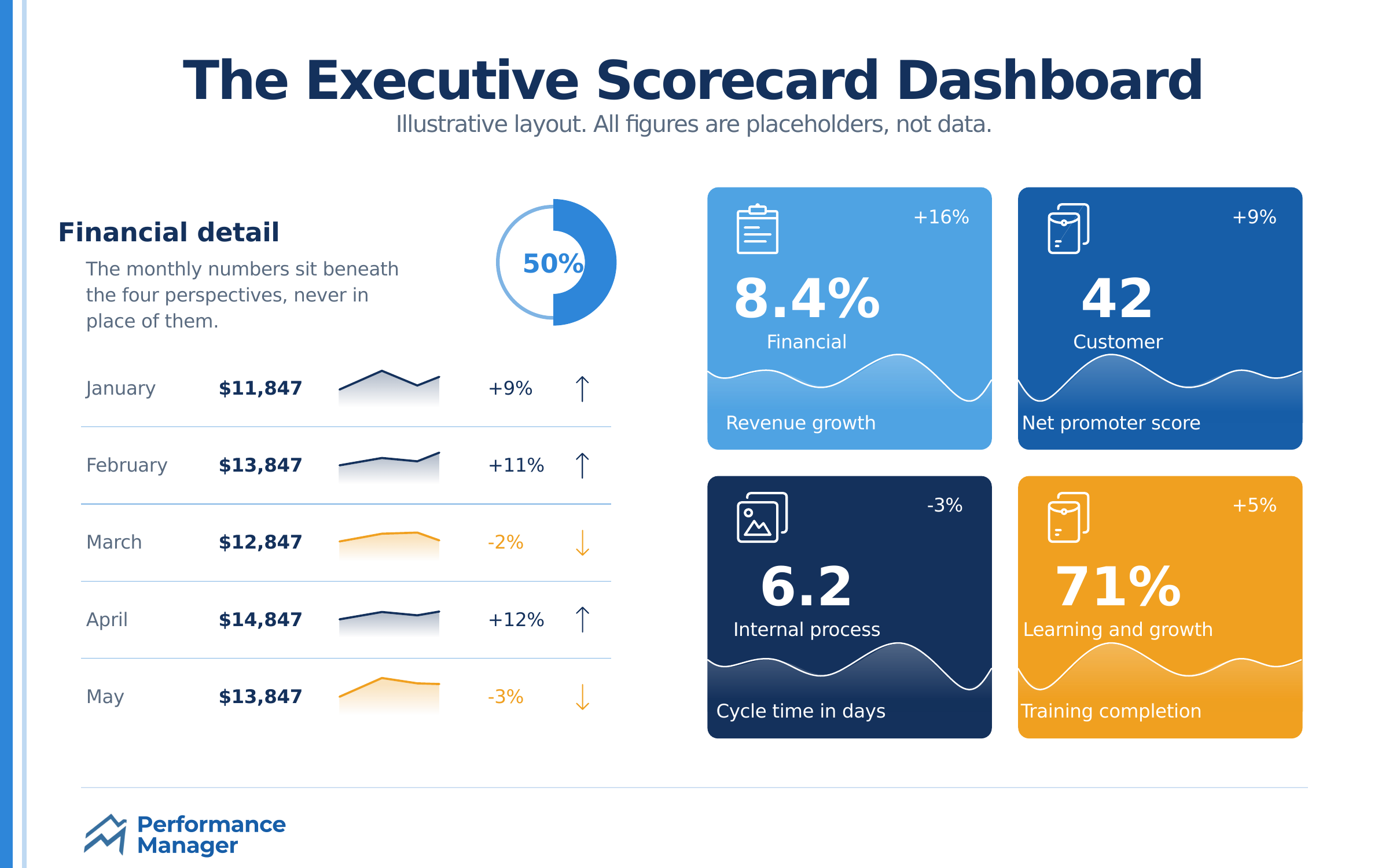
The Balanced Scorecard remains a premier framework for strategy execution. An executive dashboard developed based on this model not only focuses on what has already been done financially, but also on the leading indicators of future success.
It breaks down performance into four lenses: Financial, Customer, Internal Processes, and Learning and Growth. By watching the measures on all four of these pillars at the same time, leadership can prevent the frequent trap of losing long-term viability for short-term financial interest.
Important Measures: Rate of revenue growth, Customer acquisition cost (CAC), Process cycle time, Employee training hours.
Visual Strategy: Strategy maps and spider charts are highly effective here to show the interconnectedness of different objectives.
2. The Sales Performance Tracker
Sales environments are highly dynamic and require real-time visibility. A sales dashboard must balance leading indicators (like pipeline volume) with lagging indicators (like closed-won revenue.
Sales velocity, which measures how quickly deals move through the pipeline and generate revenue, is a critical metric often visualized here.
3. Financial Health Overview
Financial dashboards must go beyond the traditional profit and loss statement. They should give a live pulse of liquidity and efficiency.
Important KPI: Operating cash flow, Current ratio, Accounts receivable turnover, gross profit margin.
Visual Strategy: Waterfall charts are good visual representations of the flow of different revenues and costs to the net income.
4. Marketing ROI and Conversion Dashboard.
The marketing departments are required to keep justifying their expenditure. A marketing dashboard links the campaign activities to revenue generation.
It must follow the whole funnel and include the top-of-funnel brand awareness metrics and bottom-of-funnel conversion rates.
5. Talent Retention and Human Resources.
Human capital is increasingly recognized as a primary competitive advantage. HR dashboards have evolved from simple headcount trackers to complex predictive models.
They monitor employee engagement scores against turnover rates, helping organizations identify flight risks before critical talent departs. SHRM’s guidelines on predictive HR analytics.

6. Customer Success and Churn Monitor
Customer acquisition is very costly compared to customer retention. The customer success dashboards are concerned with product adoption and satisfaction.
Important Key Metrics: Net Promoter Score (NPS), Customer Lifetime Value (CLV), Monthly Recurring Revenue (MRR) churn rate, Time to first value.
Visual Strategy: Here, cohort analysis tables come in handy in determining how retention of customers changes according to the time they were acquired.
7. Operational Effectiveness and Supply Chain.
In the case of a product-based business, profitability depends on the supply chain. These dashboards monitor the physical flow of goods and the efficiency of internal workflows.
8. IT Infrastructure and Uptime
Downtime translates directly to lost revenue. IT dashboards provide real-time monitoring of system health, security threats, and resolution times.
Key Measures: Server uptime, Mean time to recovery (MTTR), unresolved support tickets, Cybersecurity threat incidents.
9. Project Management and Delivery.
Project dashboards would help in delivering strategic initiatives within the budget and in time. They monitor resource plans and project milestones.
Visual Strategy: Kanban board integrations and Gantt charts give real-time information on project statuses and bottlenecks.
Stakeholders of today require corporate responsibility. ESG dashboards monitor sustainability programs, diversity, and adherence to governance principles.
The impact of ESG on long-term brand valuation.
Designing Your Performance Infrastructure
The choice of the appropriate KPI dashboard examples is not the last step. The data architecture behind this should be strong. Even the most advanced visualization tools will not help with poor-quality data. Automate your data pipelines to limit human error and ensure real-time accuracy.
Moreover, do not give in to the urge to follow everything. Dashboard clutter is a watering down of the strategic message. Aim to have up to seven to ten metrics, as relevant as possible.
How does a metric differ from a KPI?
Although the metrics are all KPIs, not every metric is KPI. A KPI (Key Performance Indicator) is an indicator referring directly to one of the fundamental strategic purposes. A metric is merely an overview of the tactical activities in a quantifiable way.
What is the frequency of KPI dashboard updates?
The frequency is dependent on the level of operation. Executive dashboards may be checked on a monthly or quarterly basis, whereas sales or IT operational dashboards have to be efficient, which means they need to be updated in real-time or on a daily basis.
Can a KPI dashboard improve the engagement of the staff?
Yes. With access to performance information made clear to the employees, they stand in a better position to know how the daily activity will be channeled into the general organizational goal, which will result in a sense of ownership and responsibility.
Are KPI dashboards a good way to enhance employee engagement?
Yes. Employees can clearly see the performance data, thus getting a clearer picture of their daily tasks in relation to the overall purposes of the organization as a whole, which creates a sense of ownership and responsibility.